
This is a prototype of the interactive map app I designed.
https://xd.adobe.com/view/71e8f588-f350-43f8-411c-1fb66399f43e-07d9/
This is a prototype of the interactive map app I designed.
https://xd.adobe.com/view/71e8f588-f350-43f8-411c-1fb66399f43e-07d9/
Using our interactive map we now have to design a six-page leaflet detailing important information for those seeking to use it. My map is focused around the art supply and stationery shops in Kingston along the high street and in the surrounding areas. The design of the leaflet is imperative as it communicated the information for the reader, for example, you must display the location in a clear and concise way you must also make sure that the store is easily identifiable from the way you have portrayed it in your map.
In my leaflet, I will also detail some information about each store so that the user of the map can choose a store more suited to their needs. There are many retailers in Kingston so I added a large number of stores so that they could match a diverse set of creative needs.
Composition is important and must be considered carefully I designed some thumbnail and stamp drawings to implement into my design.
![]()
![]()
These are some examples of leaflets:


For my interactive map project, I’ve decided to make my app focused on stationary and creative hobby retailers as well as arts and craft, the vast majority of these stores are for stationary but I added a few shops that exist beyond stationary and art supplies to give a more well rounded and useful map. I included a bookstore so that if the person using the map is buying supplies, for example, a DIY project then they can also find the knowledge as well as the resources pertaining to their particular need.
After acquiring primary research pictures of my locations for my map, I began to design unique logos for each of my stores, I have twelve in total.
![]()
![]()
I based the design of these off their already existing logos so that people will be able to instantly recognise and identify these stores. I also used similar colour schemes as well for similar reasons.
I also designed icons for the information box on my map thinking of the immediate information potential customers need to know quickly such as if the shop is open or not or what their stock mainly pertains to, such as Fine Art supplies or office supplies. Also if they have a sale or a special promotional offer, what types of payment options they have as well as the closest and best modes of transportation.
![]()
I decide to make these symbols very similar in design but have a range of colours so that they are clear and easy to understand. These symbols will appear when an icon for a particular store is clicked and will indicate important information with their appearance. There will also be a key for these symbols so that the person using the map can understand what is trying to be explained to them.
All these drawings both map symbols and store icons require more work as they are just drafts but these soon to be developed designs have helped me generate even more ideas for my map in regards to icons and relaying information.
Interactive media is a multi-faceted form of communication that requires inputs and outputs from the end user in order to procure relevant information, it allows for full engagement between the user and the device they are using. Good interactive design must always consider the end user first, by using an easy to understand interface and common vocabulary, missing overly technical terms and by using colour as a device to bring clarity of the uses and attention to the most important details and features.
When designing interactive media the main target demographic must always be considered as they will attest to the usefulness or uselessness of certain features of the program or the whole device in its entirety. Here is a list of vital things that make a form of interactive media viable.
Interactive media often comes with terms and conditions, each set of these are specified to the particular functions of he device or service. Terms and conditions are the rules an end user must follow in order to use a certain service if you do not comply with the terms and conditions then you can not gain access to this service and its features, often these terms and conditions involve sharing personal information such as your name and age with the service provider. There are laws in place such as the Data protection laws that prohibit companies from selling your information without your permission or knowledge which is why these web providers such as apps or websites have privacy policies and terms and conditions that they honour your rights and stay within the limits of the law.
Privacy Policies and Terms and Conditions
A privacy policy is a list a principles a company will follow in order to protect your personal information. Often each time there is an opportunity to use your personal information said company will ask for permission. It is most likely that your information will be used for marketing, so depending on your age, interests and other things advertisers would market things they believe would prove useful or of interest to you, from the information they gathered from the company you shared information with, in order that you buy that their product.
Your personal information is gathered in a number of ways, the first is when you sign up or make an account with a website you input basic information like your name, place of residence, age etc. The information that is most useful for marketers are more diverse in their question range such as a questionnaire or survey. With options like these they can ask very specific questions that they can then use to advertise products more in tune with your personal desires and needs.
Another way they collect data is from pattern searching if they can access your search history or travel history to see what services and places you frequent the most they can also pick up your shopping/browsing habits and then recommend products or services that are aligned with your schedule and interests. For example if they find that you frequent Soho a lot then can advertise restaurants or food shops in that area so you would be more inclined to dine in Soho than where you usually go.
This is mutually beneficial to both the place of business and the advertiser as the restaurant is able to obtain a new customer and make a profit, whilst if the advertiser is in partnership with the place of business they too gain revenue as by being part of the driving force that encouraged the new customer, they then may also become more reputable as a business for being able to actively and efficiently market these establishments.
Cookies help in this process of data collection as cookies are minute files that are able to store a very limited amount of information, their primary targets for data collection is personal information, as this is the type of information marketers and advertisers are most interesting, they are an effective tool for these types of people as the modest amount of information garnered by the cookies can be accessed by both the client computer and the web server. The web server will then share this data with a third party which will then find something to advertise to you. Common data that cookies gather are things such as; your IP address, what device your using browsing activities.
Susan Kare
Many of Apple’s first notable typefaces and interface elements surfaced in the 1980s these were designed by Susan Kare, the graphic designer and artist whom is attributed with the design of the first three iPods and their typefaces;Monaco,Geneva and Chicago as well as the Happy Mac logo. These are her most notable works as well as being the creative director at NeXT which was the company Steve Jobs started after leaving Apple in 1985.


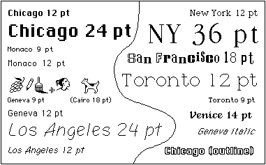
She designed many icons for Apple for the GUI which was unique at the time as it allowed for multiple window use with the help of icons. Her Chicago font also became a distinctive feature of apple macs throughout the late 80s and 90s, as it followed Job’s concept of allocating each letter with its required number of pixels instead of the previous method of making all the letters uniform.
Her typefaces became some of the latest revolutionary typefaces as they did not have the mono-spaced typewriter feel that many other contemporary typefaces had. The use of icons really revolutionised the Graphic User Interface as it allowed for clear separation of various programs and made it increasingly easier to switch between windows as the bright and distinctively shaped icons were clear in their program’s intended use, instead of only using text to label individual programs.
There was an explosion of graphic design in the 70s/80s due to the rapid increase in technology and the increased need of branding in order to make your product unique and marketing to get your product to sell and make a profit. The icons used on Apple really gave them the push they needed to break out as a new and intuitive tech company as one of the first major tech companies to use icons in this way.
A GUI is a graphical user interface this allows the end user to utilise the media source by way of graphical images most particularly icons instead of just text.
Apple’s iOs
Privacy policy and terms of service can be quite universal many of the things in google’s privacy policy are applicable in Apple’s such as: data collection and why Apple collects data, how they keep data secure whilst not transporting it and whilst exporting it, how and why they delete safely, privacy controls and who your data is being shared with, integrity retention of data with coordinators, third-parties, cookies and other tech, as well as safety precautions for children, service providers, automated decision making, and location based services.
Some restrictions for Apple are age concerned for example people thirteen are not permitted to create their own Apple ID rendering them unable to use Apple services protecting them from age sensitive material and potentially harmful or abusive content. Apples’s terms of service applies as follows: site content, your use of content, purchases, copyright, conspiracy, counterfeit, software license information and other legal matters of the sort, accounts security and passwords, privacy and other Apple services.
Material Design
Material design is a open-soured code design program for various purposes and operating software such as Android and web or flutter. It allows you to use their program in order to make a GUI for a product several large brands use Material Design such as GENIUS and LYFT. The privacy policy for material design is about data collection and why Google collects data, how they keep data secure whilst not transporting it and whilst exporting it, how and why they delete safely, privacy controls and who your data is being shared with, as well as compliance and co-operations with coordinators. So to surmise their privacy policy is all about how and why they collect your data and what they do with it.
Their terms of service is about: using their service, your google account, privacy and copyright protection, your content, their software, modifying and terminating services within the design system, warranties and disclaimers, liabilities in the service, and the potential business uses of this software.
Harry Beck
Harry Beck is the man responsible for creating the revolutionary and iconic London tube map, he invented whilst working part-time for TFL as an electrical draughtsman in 1933. At the time it was highly controversial as it was such a drastic change from the current tube map at the time. What led to the invention of the map was the fact that the previous map used the streets of London to map out the tube lines, this overground version of the underground led to much confusion as it lacked a constructive placement of the stations as they were placed according to various landscapes.
Henry Beck’s map was intuitive as it showed an underground version of the tube network it used schematics and geometry to map out the stations It is a y- diagram that uses the central line as the x-axis. With this map lines and stations no longer clashed into each other, they all had their own space and name. What makes the map even more helpful is the use of bright colours to identify each tube line, no tube line has the same colour making them clear cut and easy to define in the map.


One of the most controversial properties of this map, at the time, was that it had no scale so the distances between the station are not accurate and can actually misrepresent the actual time it takes to travel in between the two, making it harder to calculate exactly how long your journey will take. This is why the Thames still remains on the map so that people still have a sense of proximity to their desired location without the use of big landscapes. One of the reasons for leaving out a scale was so that all of London’s tube stations could fit on the same map.
Undeniably this map has greatly improved travel in London as it makes the underground system a system of clarity and an efficient mode of travel, it evokes a sense of familiarity. This original map had been dubbed ‘most successful practical map of all time’ and subsequently it has inspired several attempts of replicating the iconic map within other cities, such as New York and Paris, a few have come close but have never emulated Beck’s completely.
After eventual success with the first map Beck made more than nineteen improvements and adaptations to the map between 1931-1954. At first they were welcomed warmly until TFL completely stopped accepting the new maps and separated themselves from Beck. In the end he only ever received five guineas for his intuitive map, though he is still credited with the original inception of the map on the little handout of the tube map at stations.
This the worksheet we were tasked with completing during our research trip to Thorpe park:


